Under construction
Under construction
UX Design · UI DesignDeveloping clearer debt visualizations for Next bank
Providing users with a new way to visualize their debt and better manage their finances.
Process case study in the works.
If you are curious to know more reach out to me and we can set up a chat!


To the left you will see that the current design at the time utilized a circle graph that unsuccessfully tried to demonstrate a user's credit card limits and contracted loans, which was causing a lot of user confusion and an increase in calls to the help center.

One of the first steps I took was to organize all the ways in which users were able to visualize their debts. I also collected user analytics data to determine which screens users frequented the most

In order to ensure that all scenarios were being accounted for I created a number of documents such as this one as a supplement to the full app screen designs.

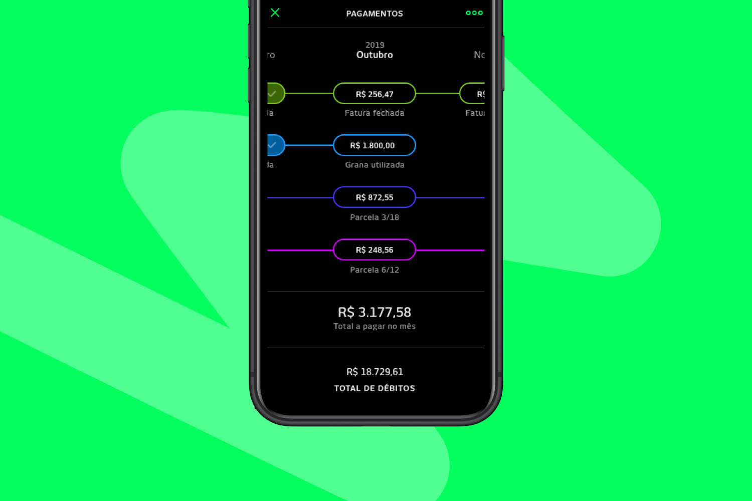
Examples of some of the screen iterations I developed and tested during the sprint

At the end of the sprint we implemented the following changes: 1. Reorientated the mindset of the screens to focus exclusively on debt owed per month (instead of overall). / 2. Streamlined the cards for each product to only show the most important information on a monthly basis. / 3. Developed a new timeline visualization to help users track their debts over time