UX Design · User research · Product strategy · UI DesignOnboarding customers to the new Klarna Card
Redesigning the onboarding experience for the relaunch of the Klarna Card in the US and optimizing across all live markets.
Role
Senior Product Designer
Team
1 Product Manager, 1 Engineering Manager, 6 Engineers
Duration
6 months
The Situation
The Klarna (credit) Card was launched in the US in April 2022 . Signups were paused after a year, due to challenges with loss rates. In November 2023, work began again to establish a more stable product proposition and relaunch the card in Q1 2024.
With much attention and resources focused on the US launch, there was also the chance to evaluate and enhance the onboarding experience in all three live markets (Germany, Sweden, UK).
The Goals
Reimagine the product offering entry point to fit new product proposition in the US and allow for more content flexibility in all markets
Increase E2E conversion in all markets
01. A new product proposition
Start of onboarding funnel
Problems with the existing designs:
We noted in our analytics dashboards that users were not swiping through to the last page of the carousel and even fewer users were accessing the learn more pages.
Lot of repeat information with current structure, opportunity to be more succinct with the messaging.
Interface was out of date with larger design system changes that were underway.
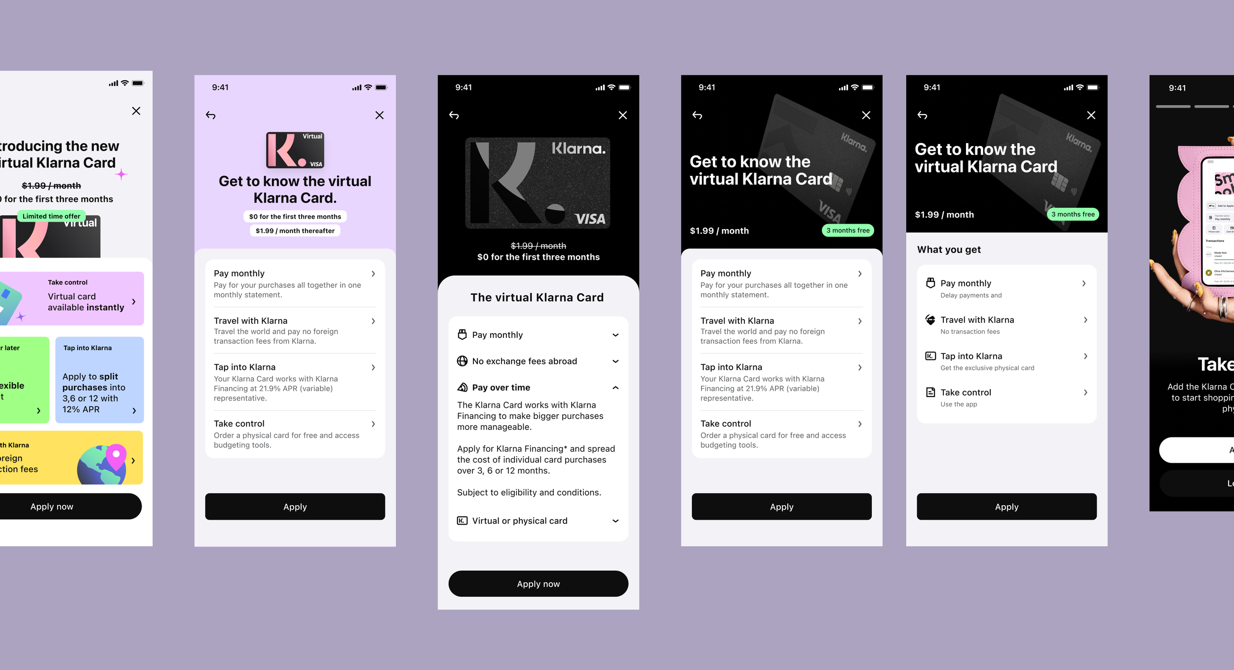
Initial proposals
I collaborated closely with the Marketing and Content Design teams to better understand the message, tone and impression we wanted to present about the new card.
I then designed and prototyped three distinct approaches which were evaluated through a series of Maze tests to assess their effectiveness and appeal.
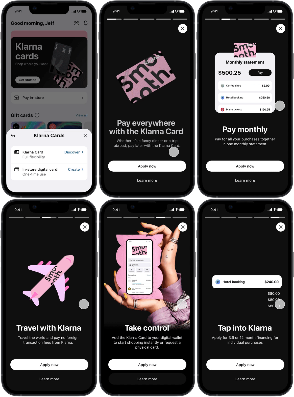
Option A: Animated carousel
Encourage users to move through the carousel
Connect the card to the features it enables
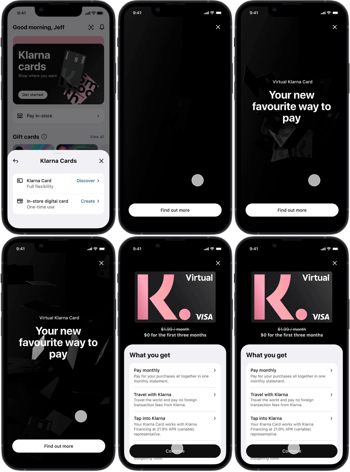
Option B: Impact video
Flashy animation
Less content, more “wow” first impression
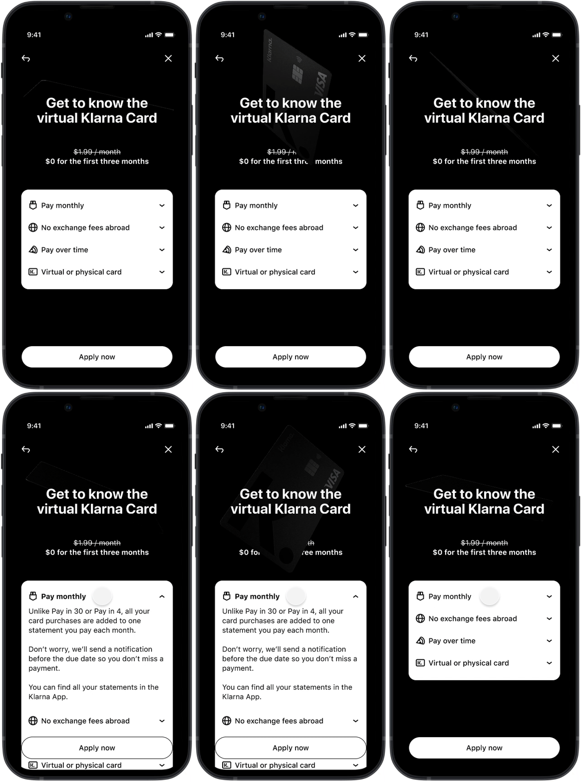
Option C: Simple accordian
More subtle visual of card
Emphasis on the key features, simply stated
Option to expand, but still keeping USP simple
“How do you feel about the amount of information presented? Too little, just right, or too much?”
“Describe the Klarna Card in one sentence”
⚡️ Results
We split the A/B/C designs amongst 60 users and after analyzing the results decided to move forward with option C. This option got the highest rating in regards to information volume and users ability to accurately describe the card features.
Next, a team of about 10 (designers, PMs, research and mid-level stakeholders) traveled to Chicago for in-person moderated prototype tests and interviews.
Structure: We held a day of interviews followed by a day of design, collaborating with content, marketing, legal, and product teams. This helped us quickly gather feedback from users and stakeholders and align our efforts efficiently.
Iterative research and rapid revision
“How would you describe what the Klarna Card is and what it allows you to do?”
“What are the main benefits of the Klarna Card? What is unique to this card when compared to the cards you have and use today?”
⚡️ Results
We used the insights gathered to significantly adapt our product offering message and also to understand which parts of the flow we needed to spend more time in the further design sprints.
Most notably we got a better idea for the mental model of how users understand statements in the US and I think it was good for European stakeholders to get this understanding and not rely to heavily on their own preconceptions.
2. Keeping people in the funnel
With the relaunch there was an opening to revisit and revise the overall flow and streamline the changes across our four key markets. My product manager and I had already begun a rough back-log of improvements that we would wanted to explore and sought to use the launch as a moment to review the flows in all our markets and streamline changes.
We noticed some drop-off in the funnel at different points in the journey and knew that there was simple updates we could do to boost E2E conversion.
Half-panel
As a first step we implemented a simple half-panel to give users a moment of pause before exiting. I worked with the content designers and localization to ensure that the copy was direct but not too pushy.
⚡️ Results:
We saw that for those who were presented with the half-panel 15-20% opted to proceed with the flow instead of abandoning. Out of these customers 28% successfully completed the application and received a Klarna Card.
Progress bar
UX best practice argues that showing progress in onboarding increases user motivation towards completion, so the lack of a progress bar in our flow was a pretty easy fast follow to correct. Albeit with a few challenges to consider first.
Main challenges
Ownership: Some parts of the authentication steps weren’t owned by us, such as third-party ID verification, which limited the influence we had over the full page design.
Security: We gather a lot of sensitive data during onboarding and needed to ensure that we were thoughtful in the way we stored it (i.e. deciding if we would allow the user to pick up progress on a different device)
Actions
Ran a one week spike with engineers to map out the flows in each market and identify the best way to handle data storage
Designed review page template that would be applicable to all markets
Ran Maze test on three different progress bar designs to determine which was the most effective
Maze testing
In order to measure success of the four options we tracked actual time to completion as well as sentiments around perceived time to completion; in addition, the follow up questions provided qualitative/quantitive data on how useful users perceived the progress bar to be as they completed the onboarding flow.
“As you were completing the task how useful did you find the information displayed in the top bar?”
“Is there any point during the task that you considered quitting? ”
⚡️ Results
Once implemented, and combined with the half-panel update, we saw a 3% p.p increase in Intent E2E Conversion in the first month and a 5% p.p. increase in the following three months.
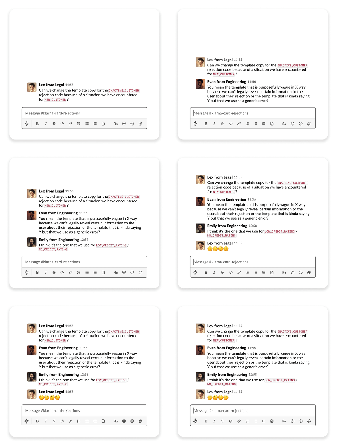
For months the team analyst and I had been noticing an uptick in customer service errands related to application rejections. At the time most of these users would receive a generic “You were not approved. Try again later” message and then reach out to support to question why their weren’t eligible.
As an immediate next step after the launch of the US Card I then pushed for an overhaul of the rejection experience in order to provide users with more context around their rejection and potentially offer pathways towards future eligibility.
3. Making rejections hurt a little less
Mapping out the why
First I reviewed the 80+ codes we received from the Underwriting team (who owned the decision of credit approval) and categorized them into four categories.
I then coordinated with Analytics and Product Managers to determine which objectives we wanted to achieve for each.
| Error category | Objective |
| Missing Data/Data Mismatch | Decrease repetitive rejections related to this category, increase data coverage |
| Eligibility criteria are not met | Decrease repetitive rejections related to this category |
| Insufficient use of Klarna | Increase % of customers with at least one transaction in Klarna, increase % of eligible customers, decrese rejections with these rejection reasons |
| Pending payment/Open debt with Klarna | Decrease rejections related to this category, decrease % of customers with debt |
Improving communication with templates
Once we had reviewed the codes, I worked with the content designers in order to develop simplified copy templates that could be used across the different markets.
Each template was organized via a numbered labeling system which made also made it easier for engineers and stakeholders to discuss and align on updates.
Before
After
⚡️ Metrics
At the time of writing these updates were still being rolled out to all the markets but we will be tracking the following metrics over the next months:
Total # of Customer Service errands tagged as “rejection”
Total # of [rejection code] rejections
Conversion rate of return customers who have been previously rejected
Results
Consistent increase in new user signups over the first 3 months
Consistent volume of Weekly Active Users over the first 3 months
